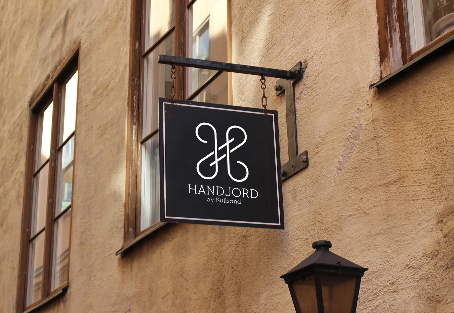
Handjord
Logotype for Handjord, a small scale producer of premium licorice, fine confectionery and luxury chocolate products. The brief called for a vintage and artisanal look. Much like Susan Kane was when she designed the symbol for the cmd button on Apple computers, I was inspired by the Swedish map symbol for interesting point on a campground. But I made it into a H (for Handjord). It also slightly resembles a safety-pin.
Tools used: Pen and paper sketching | Illustrator